|
A unique approach to Historical MappingOne Historical Map for Each and Every Year in Recorded History |
|

| Home | About the Maps | Sources | Sample Maps | Custom Maps | Books | apps | Contact us |
|
|
|
About the Maps
Overview
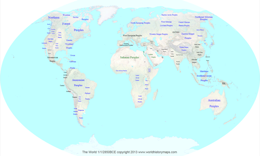
Instead of an historical atlas which has maps showing the world (or a region) at a few significant years, or maps that try to compress decades or even centuries of change on to one map, we offer a different approach. Our apps have historical maps of the world for every year in recorded history. Our historical maps show an unprecedented amount of detail in time for the whole world that cannot be found anywhere else. Looking at History in this detail gives one a unique perspective.
The essential concept of these historical maps is to show detail in time instead of detail of information. We show the entire world at the beginning of every year. Every map is consistent with every other map in terms of the information displayed, colors used, and detail shown. We believe that our maps are unique in two important respects. First, we have a complete historical map of the world for each year. We have not been able to find anything like this anywhere on the internet. Secondly, we show all countries instead of just the major ones or generic groups of countries.
These historical maps of the world show the high level political situation. We do not show any information within countries such as cities or internal borders. We do not show wars, battles, or other major events. We do not show trade or transportation routes. Only the North America maps go one level deeper and show states, provinces, and territories of the three major countries. All of our historical maps are interactive. You can zoom in to better see the detail, however zooming in does not reveal more detail. Each item displays popup information as you move over its name. There is a master index by date, country, and selected rulers. Each map also has an index to nearby maps by date at the top.
Geography
Coastlines, lakes, and rivers are shown as they currently exist in modern times. Although there have been changes in 5000 years they are not significant enough to be noticeable on maps of this scale. The one exception is the Yellow River in China because the changes there are bothvery significant and also well documented. Coastlines, lakes and rivers are drawn from the Digital Chart of the World. Relief is drawn using relative relief instead of the more usual shaded relief to give a more accurate look. Relief is based on the NOAA Digital Elevation Model. Vegetation is shown based on Natural Earth 2 which shows the world environment in an idealized manner with little human influence. We felt that this was more appropriate since the human footprint on most of the world was light until the last 200 years.
Labels
The text labels for countries, tribes, peoples, and regions are shown in a size corresponding to the area they covered. Text colors are used to denote the principal occupation of the majority of inhabitants. Blue text indicates hunter gatherers, green is used for nomadic herders, and black is used for rural farmers and all modern countries. As the maps progress you will sometimes see colors shade from one to the other as lifestyles change. The labels will also fade in and out where no exact date for them is known. The label of "Peoples" is used for regions where the lifestyle of the inhabitants is known from archaeology but nothing is known about their identity or their identity is diverse. The label of "People" is used where the identity of the inhabitants is known or can be deduced but nothing is known of their history.
Borders
For most of recorded history borders were not precisely defined. However, in drawing a map one must put a border somewhere. Unless borders were along a major river or in a densely populated area they were usually not even marked. Countries generally faded into one another and people living in the border areas were under some influence from both sides. This was particularly true where countries bordered on desert, forest, or steppe land. This is true even today in some areas where borders shown on a map have no meaning on the ground. In general on these maps the uncertainty of borders is shown by geometry. The smoother the curves of a border, the more uncertain we are of its location. In cases where a number of small countries are close together with no certain borders between them, shapes were made mathematically.
Dates
For our purposes we have dated the beginning of recorded history at 3000 BCE around the time of the unification of Egypt. Dates in the early centuries of recorded history are very uncertain. It is not until Assyrian and Chinese observations of solar eclipses were recorded that dates can be assigned with confidence. Even then they remain imprecise for many areas of the world. We attempt to show this by fading in and out or shading colors from one to another. In the index and popup information, uncertain dates are preceded by the abbreviation "c."
The Author
The principal author of these historical maps is John C. Nelson. John received his BA Degree in History at the University of Minnesota, Morris in 1964. After service in the US Navy in Vietnam he worked at the Bureau of Engraving and Printing as a computer programmer for 25 years before retiring in 1997. Along the way he received an additional MA in History from St. Cloud State University and an MSTM in Computer Systems from American University. After retirement John founded World History Maps, Inc. to pursue further computer system and web site development projects. In this new capacity John developed a GIS for historical map data and wrote programs to create one map for every year in SVG format. In 2001 the first version of the Interactive Atlas of the World was released going back to the year 1000. Maps back to 500 BCE followed in 2003. An Interactive Atlas of North America since 1492 was also released in 2003. In 2005 he digressed some and published an Interactive Atlas of the American Civil war, featuring one map for every day of the war. John followed this with several books of Civil War Atlases. Finally in 2013 the Interactive Atlas of the World back to 3000 BCE was finished. The germ of this idea dates back to 1971, and an article by Sen Dou-Chang in the Annals of the Association of American Geographers. It has taken many years for the technology to evolve where it is possible to not only create these maps but distribute them as well.